
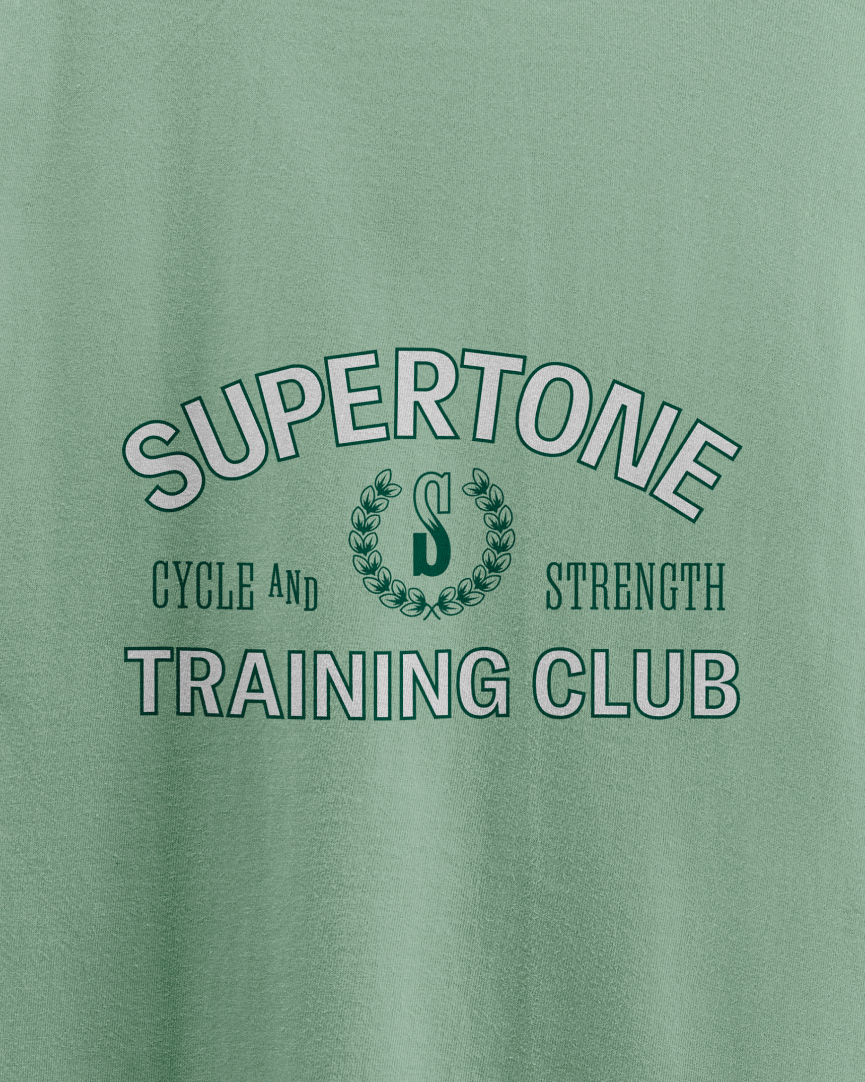
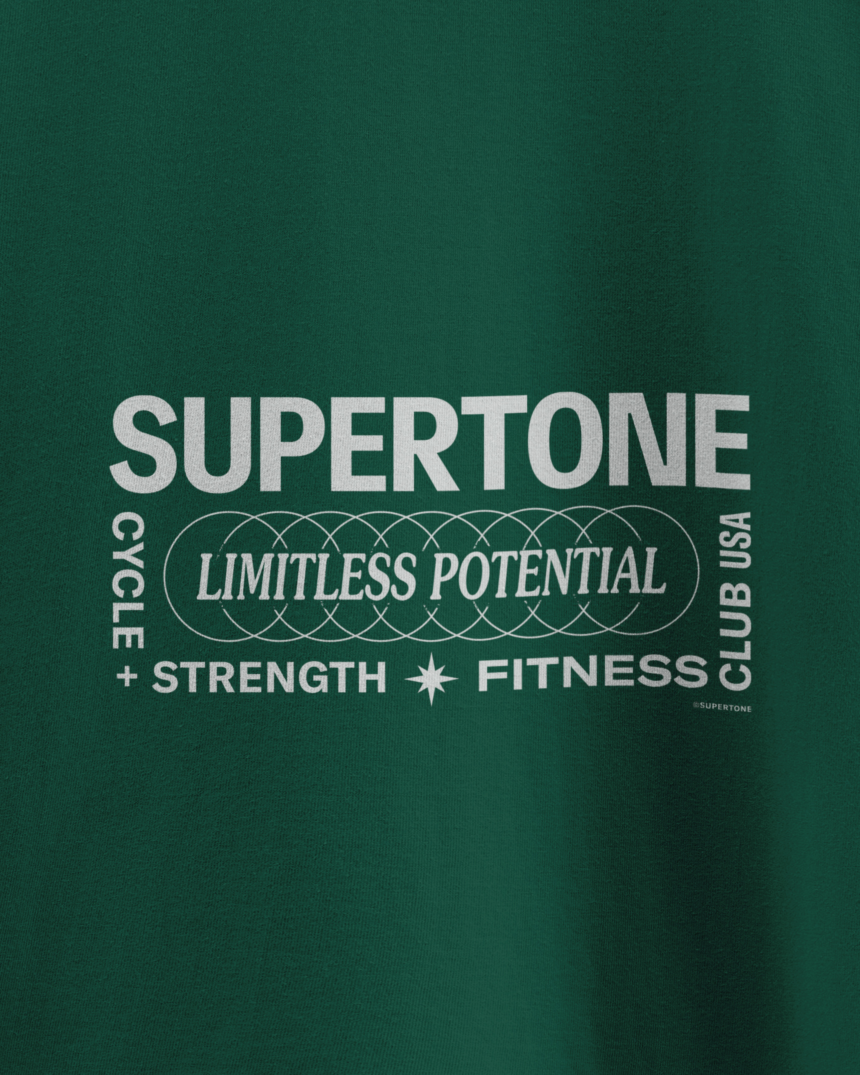
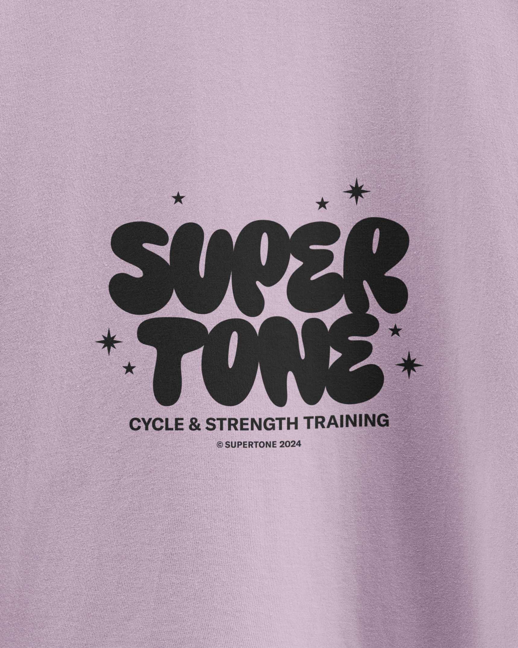
Supertone
The name captures the studio's spirit through three key meanings: "tone" as in rhythm, strength, and culture. "Super" amplifies these ideas and conveys the company's pursuit of excellence.
The Supertone identity system utilizes a logotype and a mark. The logotype features custom lettering with bold and condensed forms that suggest power and clarity. The logomark is an S built from with two symmetrical shapes symbolizing both the partnership between the owners and their dual fitness approach of strength and cycle. The center of the mark contains an 8-point star, a symbol that historically used to convey duality and balance.


Creative Director - Josh Carnley
Business Director - Shelton Carnley
Photography - Greddins
Architecture / Interior Design - David Baker Architects
Interior Design - Ellen Godfrey Design
.svg)